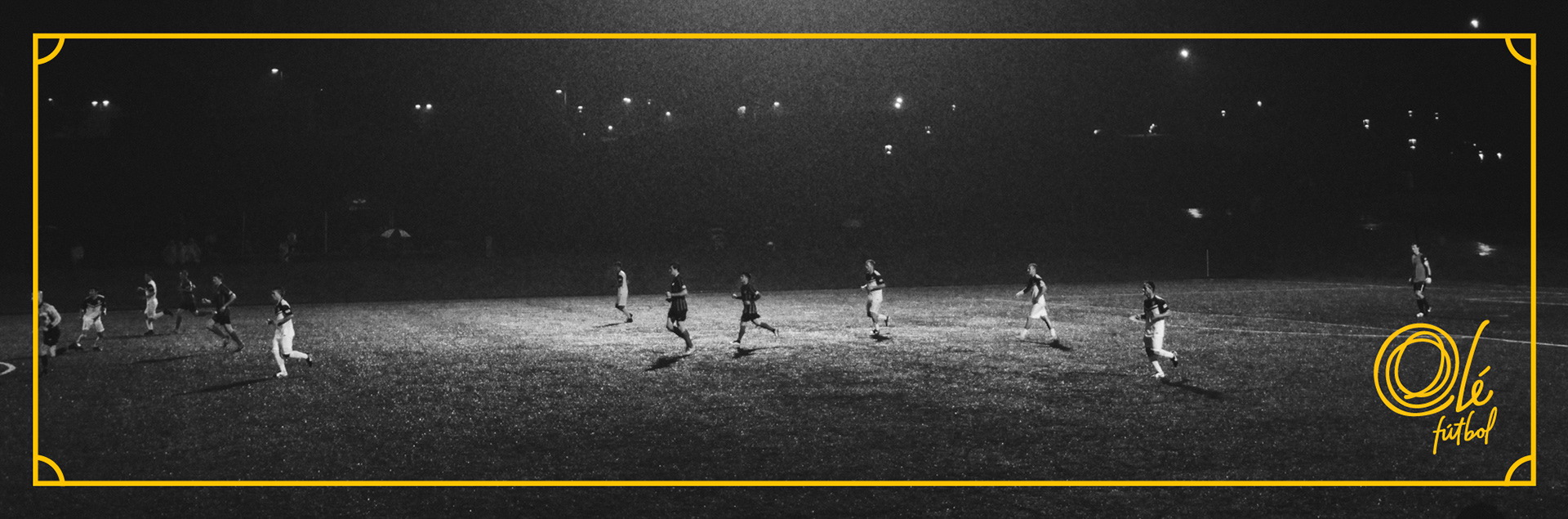
Olé Fútbol – Branding
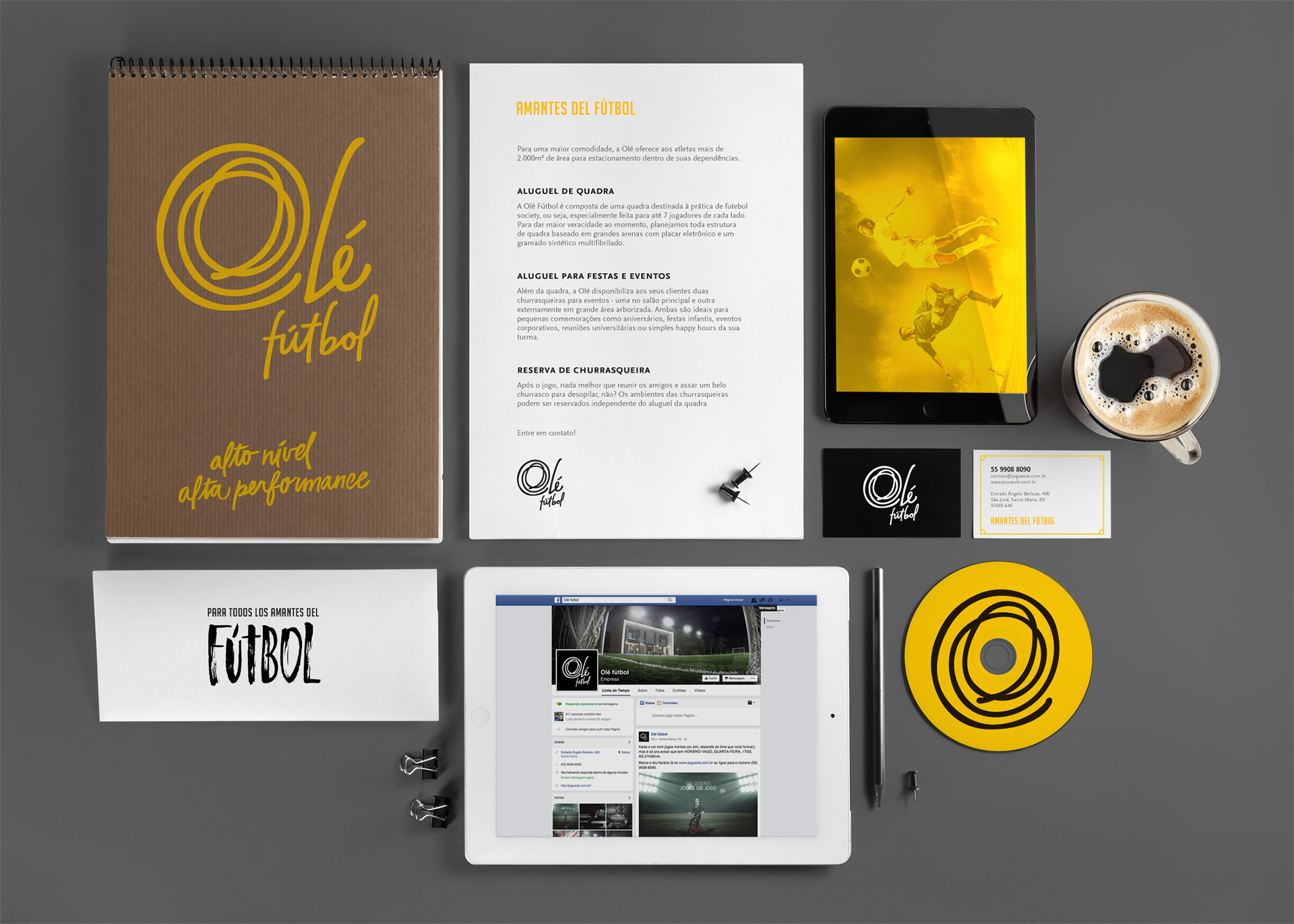
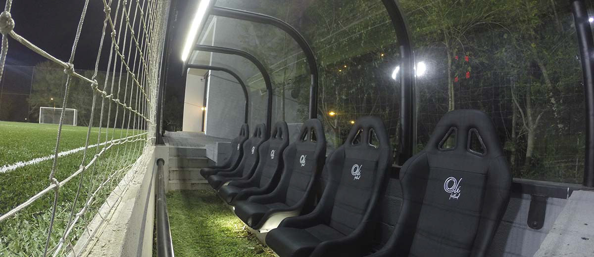
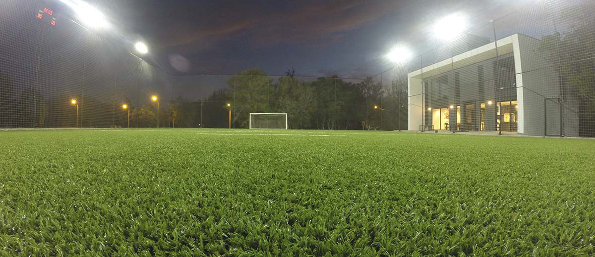
Olé Fútbol is a complex for seven-a-side soccer field rentals that also offers a space for post-match celebrations and meetings. Built with the proposal to professionalize the classic soccer with friends, the space features upscale lawn, lounge bar which is open together with the field, modern scoreboard, individual locker room, special benches, exclusive parking lot and special soccer balls.
For the brand development, the client requested us to take into account the high level of quality of the environment, the exclusive services offered and the reference as one of the best soccer fields in the city. Also, the preference for a brand that referred to an autograph, organic lines and the color black were other points mentioned.
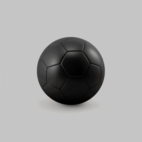
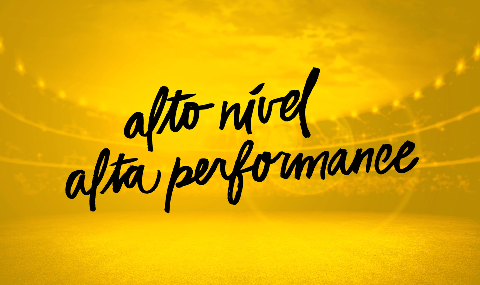
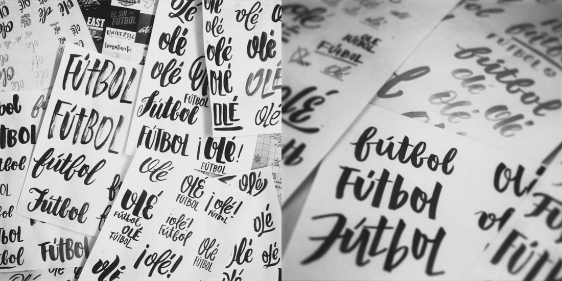
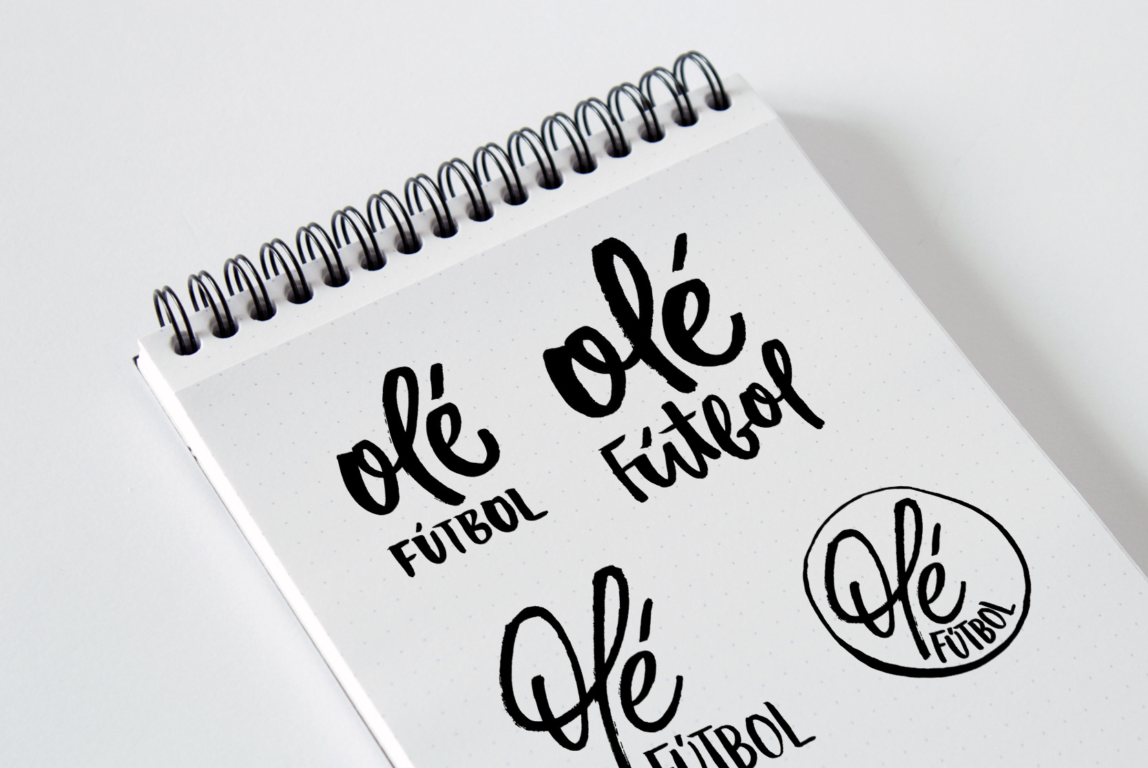
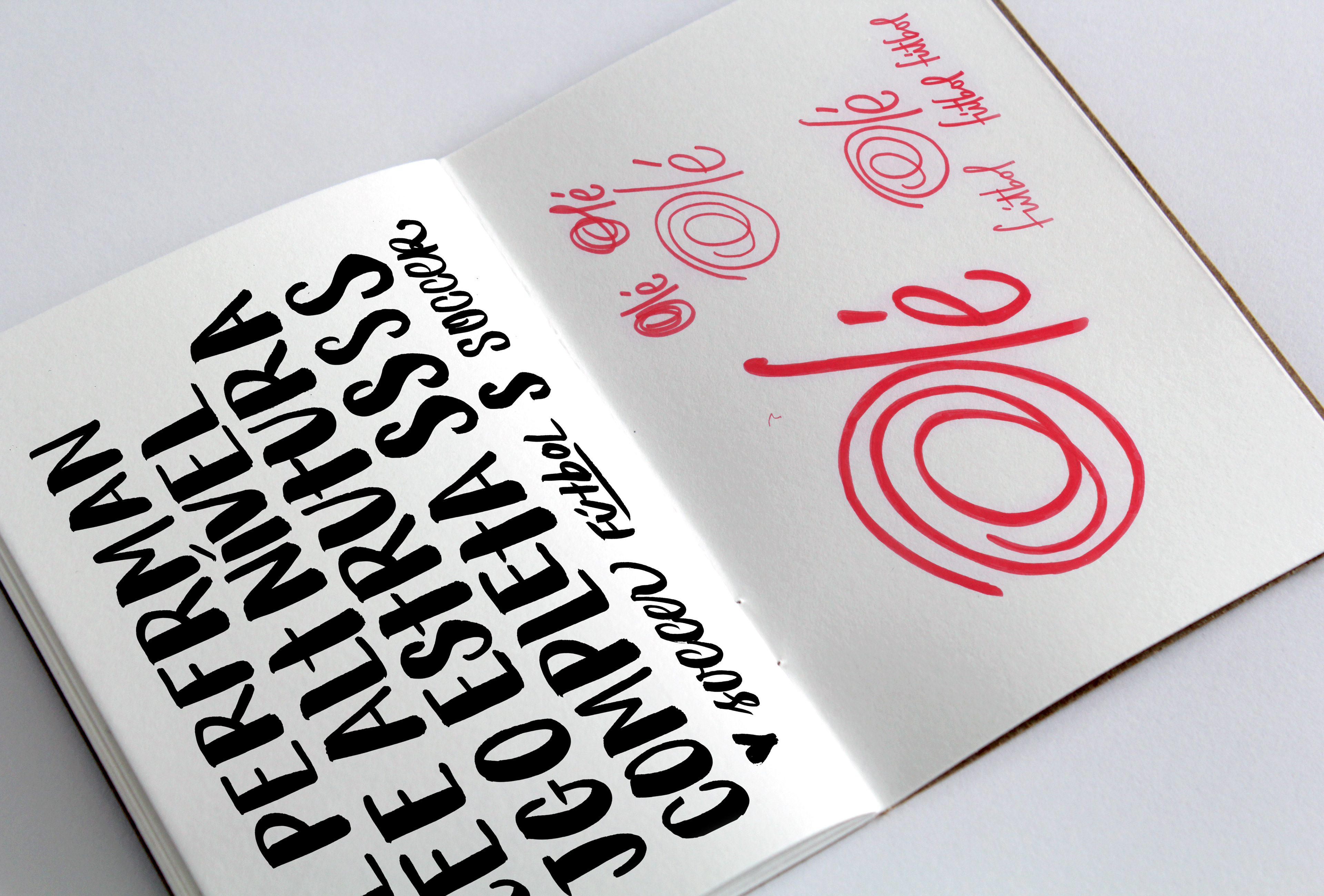
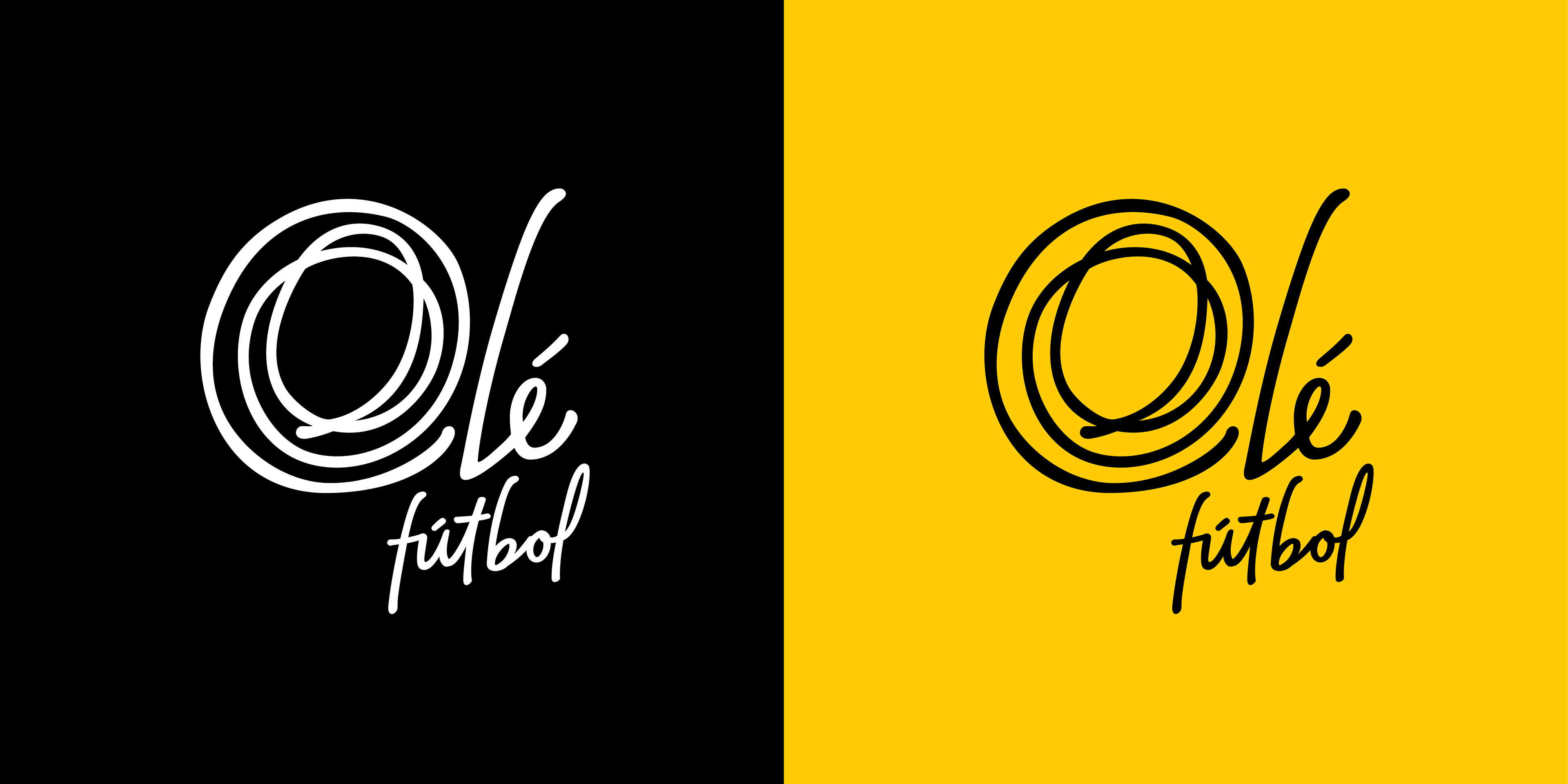
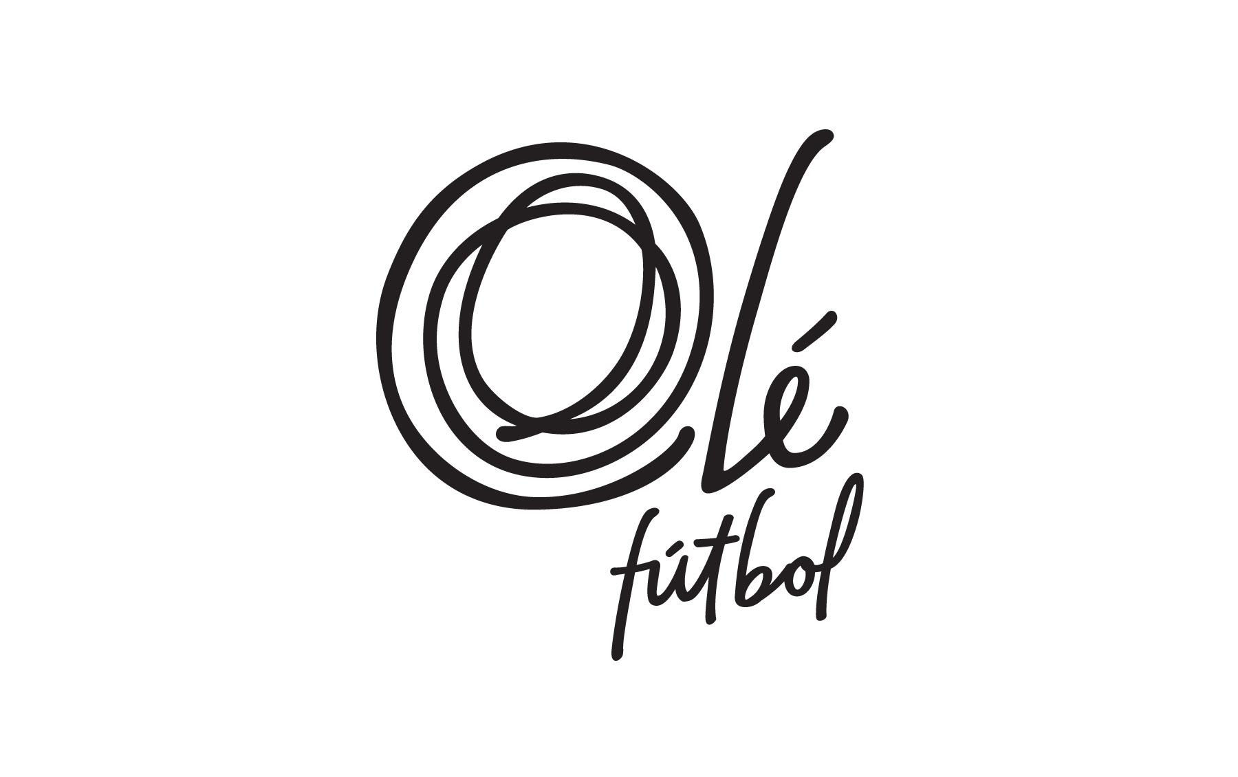
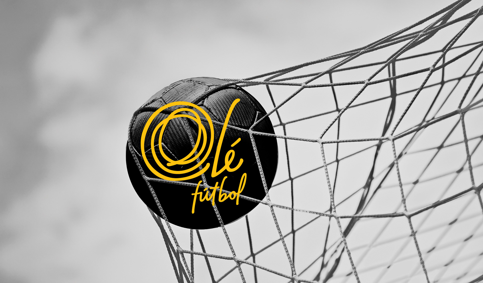
We started the graphic options valuing the manual strokes and the different use of materials. For the final option approved, we focused on the manual line that reminds a soccer ball and it can also be used as a symbol. For the color palette, we defined the golden yellow as the color that would accompany the black and greyish tones presented in the applications.
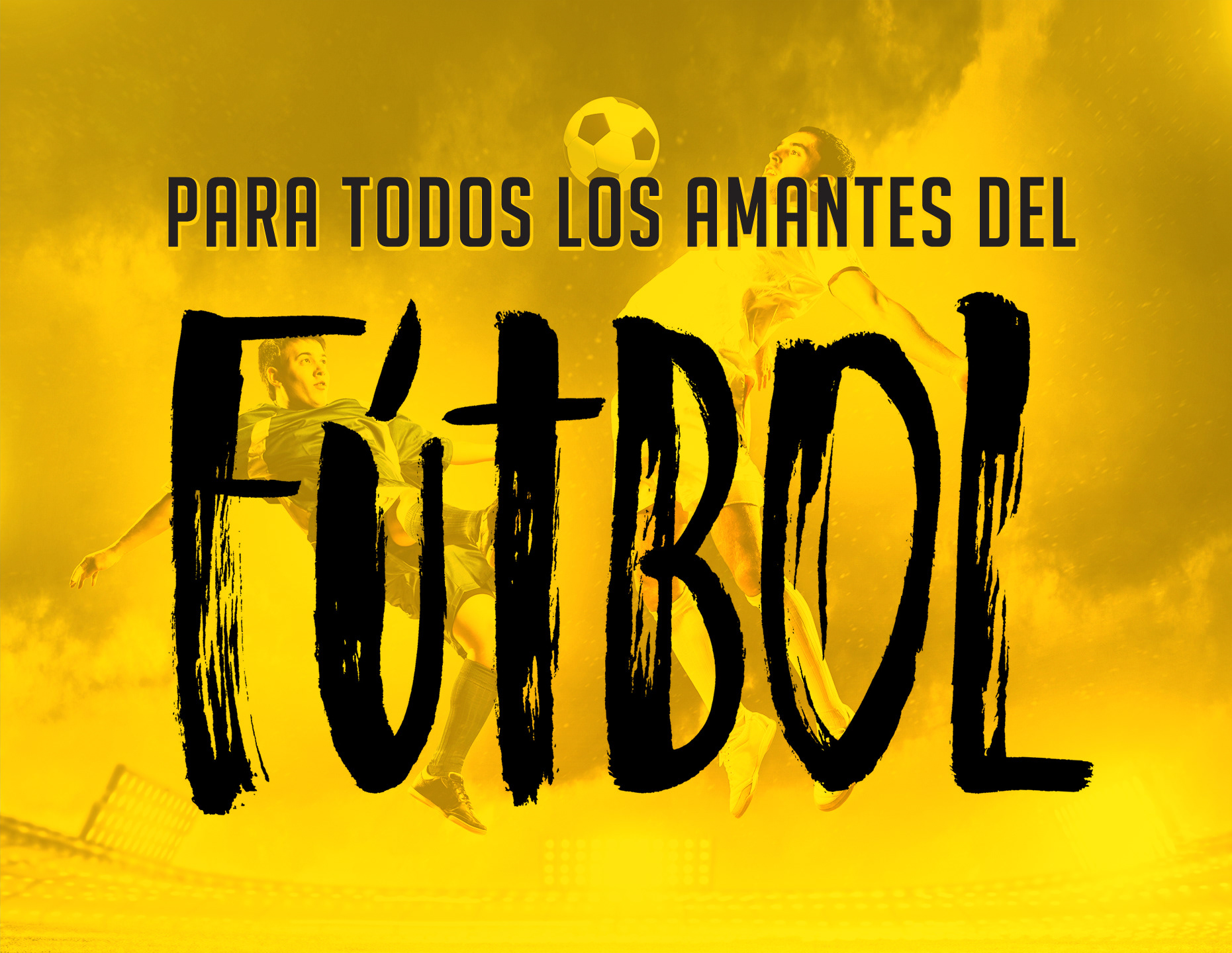
The use of handwritten phrases that refer to the soccer game, as well as the use of lines and geometric shapes that recall the limits marked on the field were the graphics chosen to complement the visual identity of the complex.
O Olé Fútbol é um complexo de aluguel de campo de futebol sete, aliado a um espaço para celebrações e reuniões pós-jogo. Construído com a proposta de profissionalizar o famoso futebol com os amigos, o espaço possui gramado de alto padrão, lounge bar que funciona junto ao horário de funcionamento do campo, placar eletrônico, vestiário individual, bancos de reserva, estacionamento e bolas especiais.
Para a marca, foi solicitado que levássemos em consideração o alto nível de qualidade do ambiente, a exclusividade dos serviços oferecidos e a referência como um dos melhores campos de futebol da cidade. Ainda, a preferência por uma marca que remetesse a um autógrafo, linhas orgânicas e a cor preto foram outros pontos citados pelo cliente.
Começamos o desenvolvimento das opções valorizando o traço manual e o diferente uso de materiais. Para a opção final aprovada, focamos no traço manual que remete à bola de futebol e funciona como um símbolo quando aplicado sozinho. Na paleta cromática, definimos o amarelo ouro como a cor que acompanhará o preto e os tons acizentados presentes nas aplicações.
O uso de frases escritas manualmente que remetem ao jogo de futebol, assim como a aplicação de linhas e formas geométricas que remetem aos limites demarcados no campo foram os grafismos escolhidos para complementar a identidade visual do complexo.

YEAR / 2015
CREATIVE DIRECTOR / Rafael Stecca
ART DIRECTOR / Daniele Vizzotto
DESIGNERS / Bruna Paz
ART DIRECTOR / Daniele Vizzotto
DESIGNERS / Bruna Paz
OLÉ'S PHOTOS / www.jogueole.com.br